
My mother deliberated endlessly between harvest gold and avocado green when selecting the appliance color for our new home. Those were the current color trends–burnt orange was as well-but it had already been eliminated by my father. He hated the other two less, but equally, that is why my mother got to choose.
My father was an artist, and matters of color were usually decided by him. This color decision put a lot of pressure on my mother. I encouraged her to go with the harvest gold. I knew that it would look great with this sunflower pendant fixture I saw at the lighting store. (Convincing my father to buy that sunflower light fixture remains one of the toughest sales of my life.) My father never appreciated the qualities of the smaller matching sunflower fixture I wanted for over the sink.
My mother and I didn’t stop there; canister set, spoon rest, towels, etc. If it was in that kitchen for more than 5 minutes it was harvest gold.
Now when I go to homes that have embraced trends like items in an “Oprah’s Favorite Things” show, I wonder two things: How much fun must this have been at the time? And how much time did it take for the fun to wear off?
Trends exist for two reasons: We like to refresh and upgrade our surroundings, and advertisers entice us to purchase the latest and greatest. Sometimes trends become classics. More frequently, trends have become trash. Color trends are perennial. Some linger, while others lose their bloom faster than a spring tulip. Since color is the easiest and least expensive way to transform a room, color trends are the most frequent changes.
Color Trends for 2010
A few years ago, the brown and blue combo hit the scene, and has, perhaps, worn out its welcome. Last year, Pantone and others were declaring that yellow was the color to conquer the palette. The Color Marketing Group went so far to say that mauve would make a comeback.
This year Pantone’s Color of the Year is Turquoise, number #15-5519 to be exact. Pantone feels that Turquoise has earned this honor in part because it “inspires thoughts of soothing, tropical waters and a comforting escape from the everyday troubles of the world, while at the same time restoring our sense of well being. ” I believe that not all turquoise colors conjure the same feelings in everyone.
Have Color Guide, Will Travel
What’s the best way to use trends to refresh your interior without looking like you got stuck in a time warp? Determine the color palette that works for you. A color consultation with a designer is a great place to start and will leave you with a practical tool for selecting color for your spaces: a customized color palette.
Armed with your custom palette as a shopping tool you can begin to transform your surroundings. Having a color guide that fits in a purse or glove compartment allows you to easily compare your palette with possible purchases and quickly eliminate costly mistakes. The infusion of trends then becomes deliberate.
If during your color consultation you discovered your preferred palette is warm neutral, rather than incorporating turquoise #15-5519 you would choose colors from Sherwin Williams paint strip #32 or #33. The trend color then slips comfortably into your space like a friend rather than an intruder. Long after the turquoise trend has been sent packing, your interpretation of the trend is still welcome because you have made it a part of your authentic style.
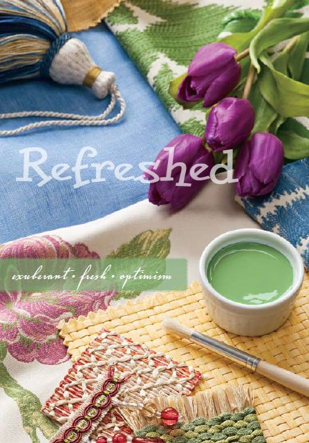
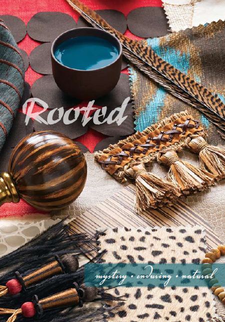
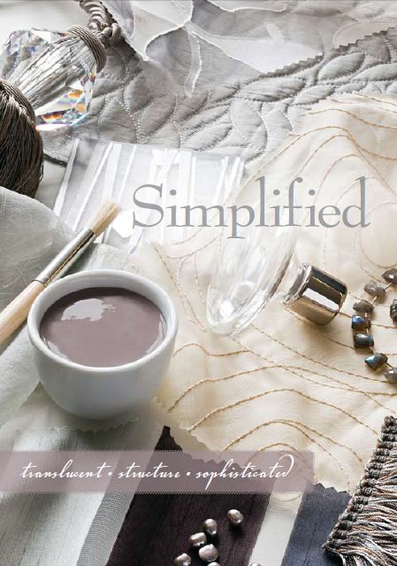
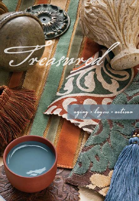
Designer fabric manufacturer Robert Allen/Beacon Hill has collaborated with Sherwin Williams for the past two years by coordinating; fabrics, trims, and paint colors in their Colormix collections. Colormix 2010 has four new offerings; Treasured, Rooted, Inspired and Refreshed. Your customized color palette will steer you to make the appropriate adjustments to these sets. Robert Allen/Beacon Hill products can be purchased through a professional designer.
Everyone knows that grocery shopping without a list can result in massive overspending and mis-selection. By shopping for your home with a list and a color palette, you’ll save because of the mistakes you won’t make. You won’t believe how comforting your home feels once your surroundings are in harmony.
Cary Baumann, ASID, will be on the Better Living Theater and in the ASID Design Solutions area at the St. Louis Builders Home and Garden Show.For more tips, read these green home design ideas.