
Happy New Year! Let’s pick up where we left off for the final installment of spa baths.
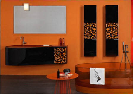
Shades of orange and peach are warming tones that increase energy levels and inspirational thought. Orange is a color of fun and friendliness and is best used in activity or creative areas. It stimulates the pulse rate and appetite and is known to energize the thyroid and respiratory system. Orange happens to be one of my personal favorite colors and can look great in a bathroom, but its probably best reserved for other areas of the home.
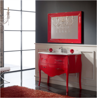
Then there ís sexy, powerful red.
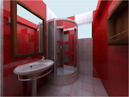
This passionate color stimulates and excites the vitality of the body and mind. Shades of red promote alertness, strength, courage, sensuality, and sexuality. Transversely, rage, anger, and revenge are the polar values of this commanding color. Red can increase circulation and the pulse rate, raising blood pressure and breathing rates. All of those factors, both good and bad, make red a color that you probably will not want saturating your bathroom. If itís red that you absolutely must have, utilizing a softer shade of magenta, rose, or coral may be more appropriate.
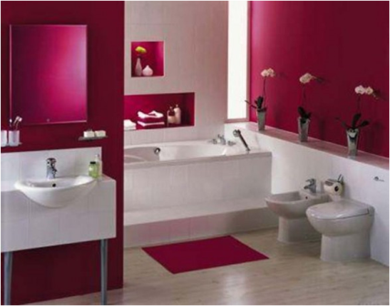
Splashes of red may also be more desirable than complete saturation for an ideal spa bath.
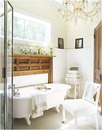
What about white for your spa bathroom, you ask? White contains the entire light spectrum in perfect balance and consequently influences all the systems of the body. Crisp white neutrals are absolutely brilliant in a bathroom! Most of you probably already have white plumbing fixtures, so itís easy build off of those elements. White can encourage creativity while it simultaneously strengthens and nurtures the soul. It generally feels fresh, pure, efficient, and clean and is easy to incorporate into various decors, whether traditional, eclectic, or modern. When in doubt as to what color to use, you can seldom go wrong with white.
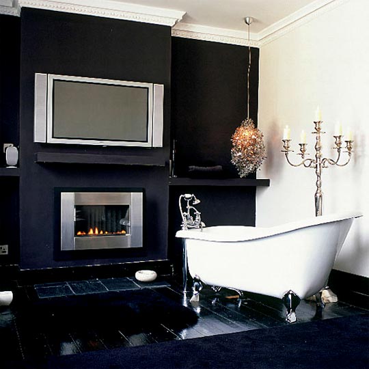
How about the non-color color, black? Really? Black for a bathroom? Many people shy away from black, thinking that it would be too dark for a smaller space like a bathroom. To the contrary, dark colors can sometimes make a space feel larger when used correctly. Black neutrals feel wonderfully masculine and glamorous when done appropriately.
Black is a protective color that has calming effects ñ especially to more sensitive individuals. It is most effective when used in conjunction with shades of white and should be used in combination with other colors. Of course, too much black can cause undesirable feelings like depression, fear, suspicion, and paranoia, so take care to use it in moderation.
Finally, letís talk brown. Some of you may be thinking, yuck, why would I want brown in my spa bathroom? Keep in mind that brown can come from a variety of sources, not just limited to the wall color. Most wood tones are brown, so it can be incorporated with a lovely wood vanity, your mirror frame, or even a teak or bamboo bath mat.
However, I am absolutely not opposed to brown walls, especially when used in conjunction with complementary clean, white bath fixtures and other accents. Brown neutrals can feel earthy and organic, which is very beneficial in creating a nature-inspired bathroom. Brown is a valuable healing color because it calms, stabilizes, and grounds emotions. Brown can help you rediscover your center. It even is known to calm hyperactive children!

I know there are about a million other colors that we could get into, but Iím already pushing my luck with the length of this commentary. Plus, most of those other colors are shades and variations of the colors that I discussed above. Whichever color direction you choose to use in your spa bathroom, remember that color is personal and it should benefit the wellbeing of your body and soul. Choose colors that complement your skin tone in the area where you apply make-up, and choose colors that generally make you feel good. Combined with good lighting, color can be all that you need to create your ideal home spa sanctuary.