
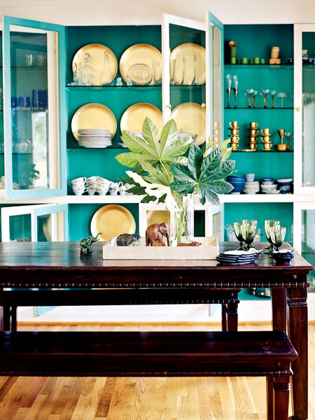
Color Pop: Using Bold Citrus Accents by Kimberly Reuther
Summer is such a fresh time of year! If you are like me, you may be obsessed with bold citrus hues this time of year. The vibrant colors are on par with the blazing sun and the days spent poolside. Why not infuse a bit more of this color into your home? Here are examples […]
Color Scheme 101: When to Select Paint Colors by Kimberly Reuther
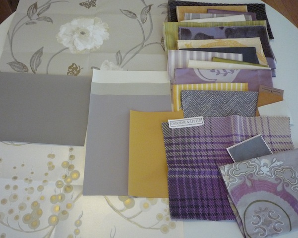
One of the first thing most of my clients ask for is help in selecting paint colors for their home. As anyone who has painted the same room several times over can attest, finding the right color is tricky! It makes sense to call in a professional and we’re happy to jump in! However, choosing […]
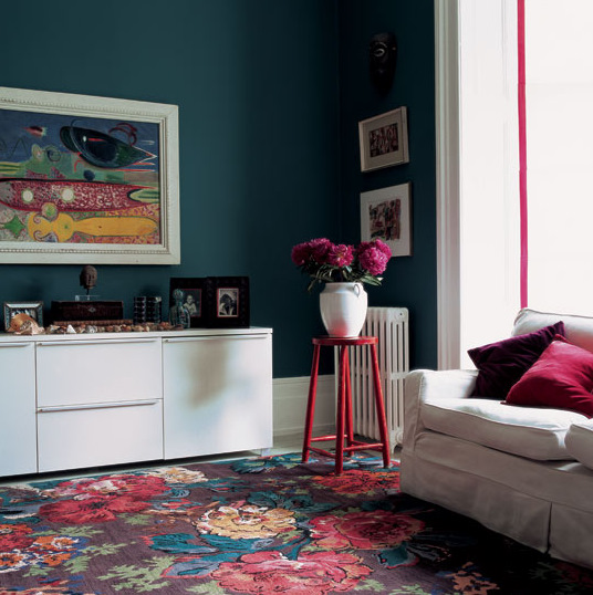
2012: year of orange by kimberly reuther
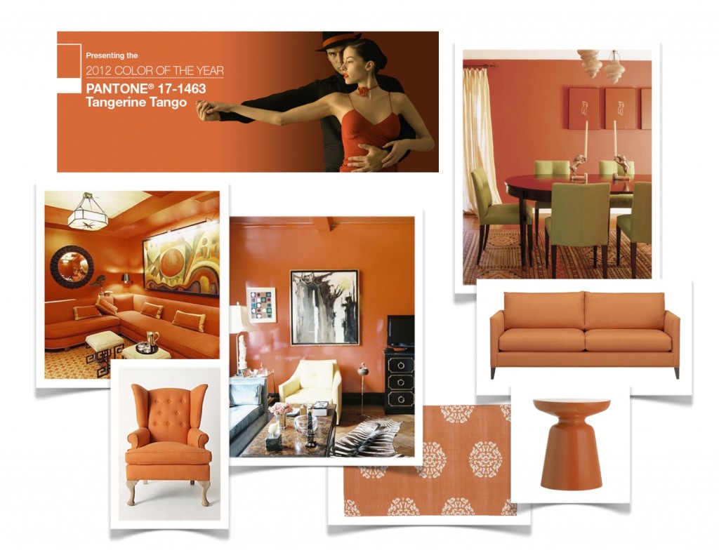
Hello Orange! Tangerine Tango has been chosen the color of the year by Pantone. What a fresh start to 2012! Orange can be a very tricky color, people usually love it or hate it. Well, let’s take a closer look at its merits and I bet you’ll start to warm up! Orange has the energy […]
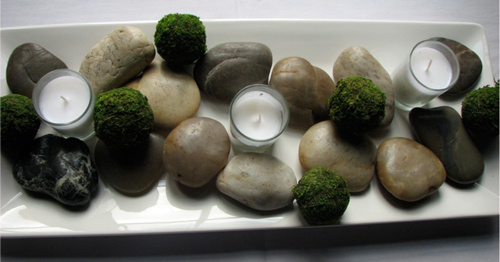
the holiday season: a celebration of light by juliana schafer
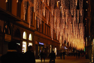
Every year, between November and January, there are many aesthetics that come to mind. For some, it is the colors red and green, for others a well decorated tree, but probably the most powerful thing is the presence of light. A certain romantic atmosphere of twinkling lights that appeal more to our hearts rather than […]
did you bloom with color?
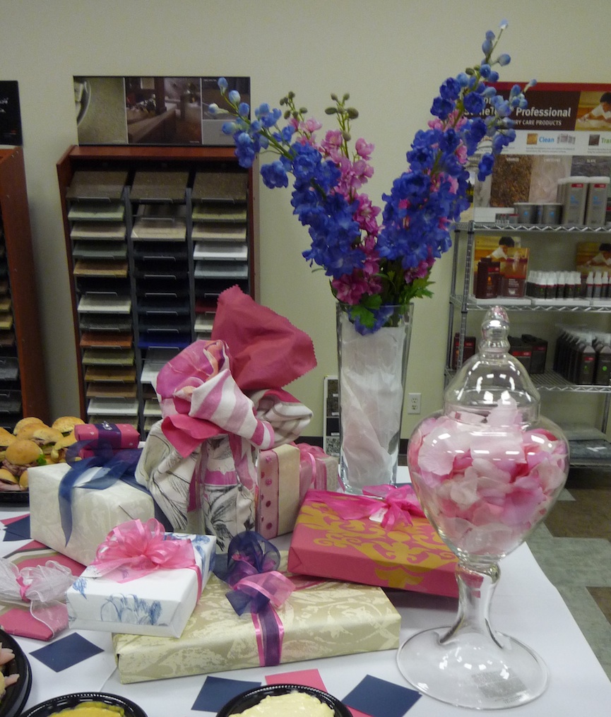
I apologize I am just getting around to posting recaps of some of our amazing events this spring/summer! Here are highlights from our appreciation event for designers this past May… I first have to extend a HUGE thank you to all who participated in our outstanding colorbloom event!!! Our first collaboration with Sherwin Williams was […]
DIY Wedding Story by Andrea Beckman
Whenever I post a blog, I try to do it on something that signifies the notion of “blooming where you’re planted.” Whether it is through design or another form, it’s about finding a way to live beautifully in the situations and places in which we reside. So when my dear friends, Brandi and Ryan asked […]
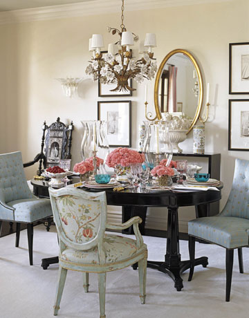
Style Defined: Tropical by Kimberly Reuther
As we approach the heat of the summer months, I am inspired by the tropics where it is warm all year round. The ocean is near, palm trees are in abundance and daily life is about staying cool. The vacation-inspired vibe is envious and actually pretty accessible in your own home. Here a few photos […]
Working With An Interior Designer by Victoria Dreste
Gone are the days of the interior designer who comes sweeping into your home declaring everything hideous and demanding the removal of everything you own. Today a designer is more likely to meet with you, ask questions about your likes and listen carefully to what you have to say, helping you to discover your personal […]
Area Rug Inspiration By Victoria Dreste
Thinking of buying an area rug? What will it do for your room? A rug can define the areas of a large room. It can add definition to a small room. Color, pattern and texture are important elements in interior design. An area rug can add each of these to a room. A rug. of […]
Bottom Line: White Kitchen Countertops by Kimberly Reuther
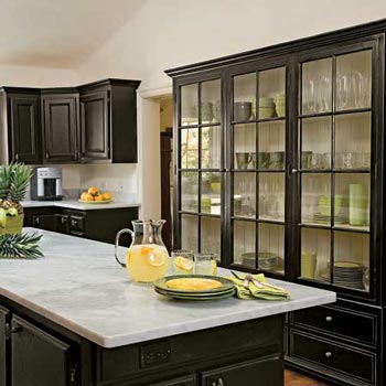
You’ve seen them everywhere lately, it seems. No, I’m not talking about holiday decorations (although that is true, too). I’m talking about white countertops, mainly marble. They are in design magazines, on TV shows, in hotels & restaurants and even your neighbor’s newly renovated kitchen. They are beautiful and alluring yet you are wondering if […]