
“Gray’s Anatomy” by Kimberly Reuther
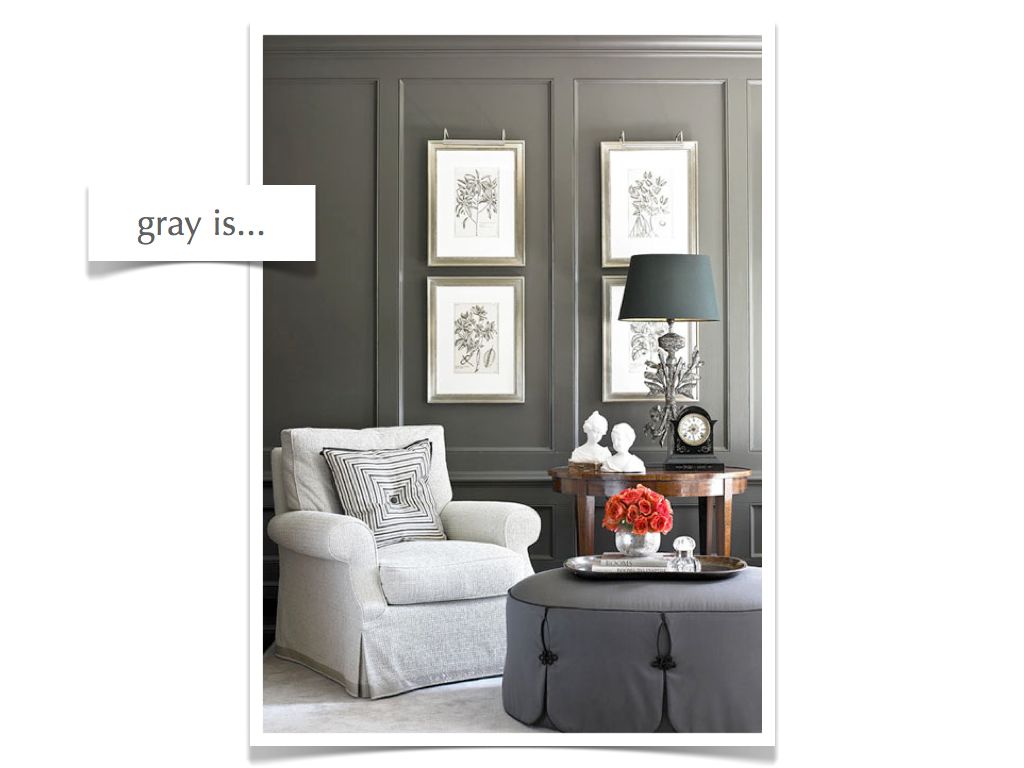
Gray is a significant neutral color that often gets overlooked in favor of the more dramatic black or the happier camel shades. However, this year, gray is the belle of the ball. It is enjoying a resurgence in fashion, home design and luxury style. So, what makes gray such a fabulous color and how do […]
Like a Well-Aged Wine…Vintage Furnishings are Being Uncorked by Kimberly Reuther
We’re finally catching on…albeit slowly For centuries, our contemporaries around the world have been perfectly content living in vintage buildings and homes. With peeling plaster walls, dramatic moldings and herringbone wood floors, these interiors are reminiscent of previous decades and remain intact for new generations to appreciate and enjoy. Americans, however, have long favored the […]
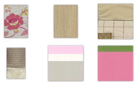
Inspiration to Design: Orchid Flower by Victoria Dreste
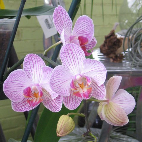
Bountiful color is all around us. I have a new favorite color at least once a week. Taking these glorious colors and using them in your home can be a bit tricky. I have put together inspirations and designs to show how to take the wonderful color you see in the world around you and […]
Inspiration to Design: Hibiscus Flower by Victoria Dreste
Bountiful color is all around us. I have a new favorite color at least once a week. Taking these glorious colors and using them in your home can be a bit tricky. I have put together inspirations and designs to show how to take the wonderful color you see in the world around you and […]
DIY – Chevron Pattern Dresser – Kimberly Reuther
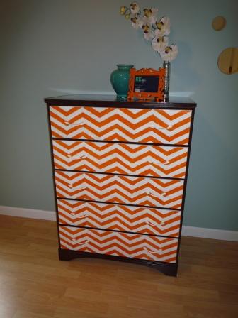
Those who know me best are well aware of my ability to envision possibilities in almost any space and are always pleased with the finished product. However, knowing my visionary ability means they are also cognizant of my low tolerance for detail work and executing these visions myself. Therefore, when I conceptualized transforming this drab […]
Guest Post: Infuse 2010 Color Trends Like a Pro by Cary Baumann
My mother deliberated endlessly between harvest gold and avocado green when selecting the appliance color for our new home. Those were the current color trends–burnt orange was as well-but it had already been eliminated by my father. He hated the other two less, but equally, that is why my mother got to choose. My father […]
Think Big! Using Accent Colors in Your Home by Kimberly Reuther
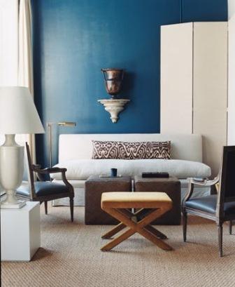
So, you love to wear that blue sweater and it really makes your eyes sparkle. You always get lots of compliments and basically deep blue is your favorite color. How do you incorporate that into your decorating scheme? Bold accent colors are not for the faint of heart! For those of you that love color, […]
New Inspirations by Kimberly Reuther
So, the groundhog saw his shadow and we have 6 more weeks of winter, blah! Time to start planning for spring while we wait…I’m a huge planner! Getting things done is another story, but at least I have a plan 🙂 In searching for unique things to admire, I came across a few global items […]
Think Big: Using Accent Colors in Your Home – Kimberly Reuther

So, you love to wear that blue sweater and it really makes your eyes sparkle. You always get lots of compliments and basically deep blue is your favorite color. How do you incorporate that into your decorating scheme? Bold accent colors are not for the faint of heart! For those of you that love color, […]
color trend: peacock, turquoise, teal by paige gilbertson
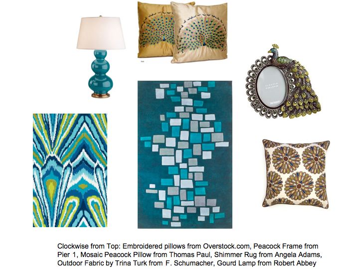
Not only are peacocks showing up as decorative motifs, but the deep turquoise color is quickly gaining ground as a top color trend of Winter/Spring 2010. From punchy, modern patterns on rugs and fabrics to sophisticated classical ceramic lamps, this deep teal tone can work with any style. Think peacock silk curtains with white leather […]