
Sustainable Living out of reach? I do not think so! by Elaine Freund
The famous St. Louis Art Museum debuted their new East building to the public on June 29th. Weightless and airy are just a few words to describe the white oak floors, dark polished facade, skylights, and concrete coffers. Designed by British architect David Chipperfield the expansive East building is 210,000 square feet and Gold LEED […]
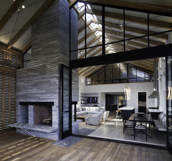
ST. LOUIS “GREEN” – PART ONE; WHAT SHADE OF “GREEN” ARE YOU?
by Derek Maschek (MASCHEK design and fabrication, LLC) MASCHEKd@MASCHEKdf.com The problem; how to create a cost effective “green” home (or any other building) in the St. Louis area, and this includes renovating an existing building as well. This is ground that has been tread aplenty in recent years, and yet remains ambiguous to many home […]
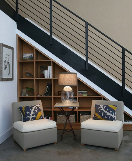
Part 1: “Designing Small is Designing Smart” by Derek Maschek
Welcome to the most important part of the design process and woe to those that try and cut this corner altogether, or fail to go through it properly. Believe me, there are those that try, and all regret it without exception. So pay attention and listen up! Ready? Here it is… Programming. Sounds technical, and […]
Intro to “Designing Small is Designing Smart” by Derek Maschek
Smarter and Smaller Houses, an Introduction to Design Last year, Merriam-Webster voted “austerity” the apparently coveted status of Word of the Year. The negativity around the term can be seen in the riots of Greece and Spain and Great Britain. The word “austere” includes definitions such as “stern and cold in appearance”, “markedly simple or […]
guest blog: green renovation by Diane Rosen
Thrilled at the prospect of creating a room, really creating a retreat from an existing garage was all at once exciting and challenging at the same time. Let me take you on this adventure………. The Vision: Collaborating with my clients, their thoughts, needs and wishes….”I’ve always wanted, thought about…” Ahha…a lake retreat with emphasis on […]
diy headboard wall – part 2 by andrea beckman
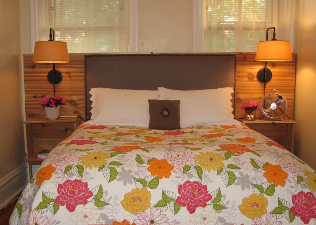
At last….I’ve finally completed my ‘headboard wall’! If you have not checked out my first post diy upholstered headboard – part 1, I started this project over two months ago and it has been on my ‘to-do’ list for about seven! None the less it’s finally complete and I’m happy to say it turned out […]
DIY Wedding Story by Andrea Beckman
Whenever I post a blog, I try to do it on something that signifies the notion of “blooming where you’re planted.” Whether it is through design or another form, it’s about finding a way to live beautifully in the situations and places in which we reside. So when my dear friends, Brandi and Ryan asked […]
Where It’s At: FORM 2011
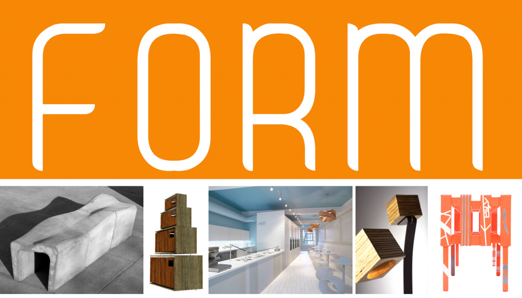
So, if you haven’t already heard of this amazing contemporary design & furniture show, you may be living under a rock… Last year, The Luminary Center for the Arts debuted an event that brought hundreds of underground modernists out for speculation and awe. In a city so unusually traditional, I was amazed to meet a […]
Going ‘smart’ by Jamie Briesemeister
Smart phone, smart home, smart… appliances? Yes – even those. Our life is filled with ‘smart’ technology that enables people to interact with each other, the home, the office – the world – like never before. It’s extended into our mobile phones – creating mini-computers we use to text, check email, browse Facebook, bank online, […]
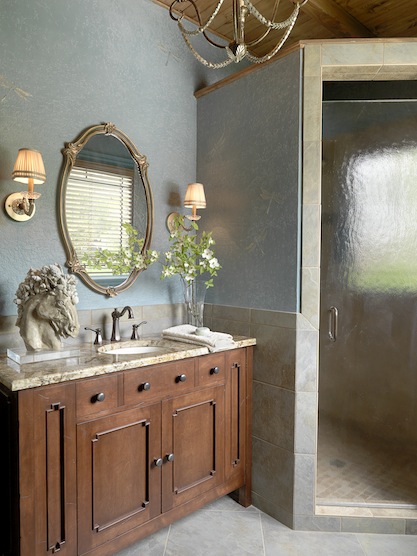
Healthy Abode: Spa Bath – Part 3 by Melanie Holden
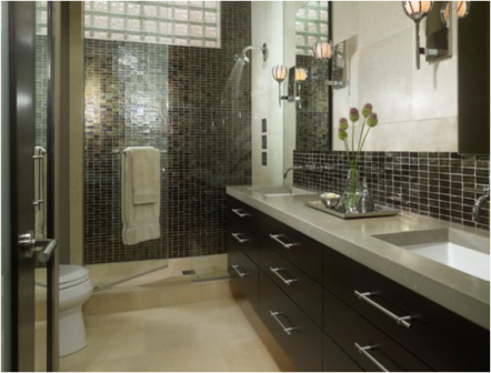
Happy New Year! Let’s pick up where we left off for the final installment of spa baths. Shades of orange and peach are warming tones that increase energy levels and inspirational thought. Orange is a color of fun and friendliness and is best used in activity or creative areas. It stimulates the pulse rate and […]