Inspiration to Design: Hibiscus Flower by Victoria Dreste

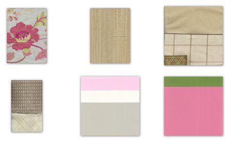
Bountiful color is all around us. I have a new favorite color at least once a week. Taking these glorious colors and using them in your home can be a bit tricky.

I have put together inspirations and designs to show how to take the wonderful color you see in the world around you and bring it into your home.

Inspiration Photo

The combination of white hydrangeas and intense pink hibiscus is bright, lively and lovely.

Color Scheme Design

The selections I have made take those colors and use them to create a well designed balance home.

The design includes (left to right): a floral printed linen, strie stripe silk, plush velvet, woven plaid, flat-braided trim, wool carpet and quilted cotton fabric.

The Sherwin Williams paint colors can be used in various combinations throughout the home to create schemes from bright and lively to soft and quiet.

Listed in order (top to bottom, left to right):

SW6575 Priscilla

SW6385 Dover Grey

SW7029 Agreeable Grey

SW6431 Leapfrog

SW6577 Jaipur Pink


luxe trend: faux turtle shells by paige gilbertson

This is Kelly Wearstler’s Design for La Marea in The Tides South Beach

The goods: Karen Roberts Collection

The application:


5 questions with Peter Julian of Scalamandre fabrics by Victoria Dreste

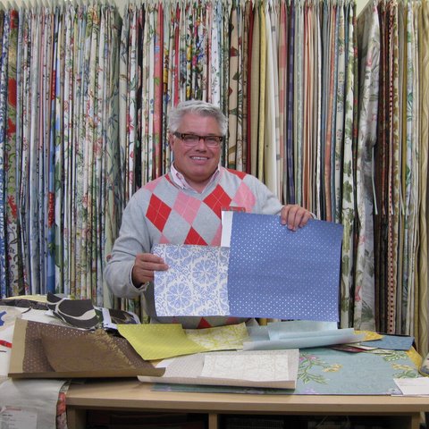
Peter Julian is the representative for Scalamandre fabrics in St. Louis & Kansas City. He assists designers on their projects and is lucky enough to spend all day “swimming” in luxurious fabrics!

Vicki: Tell me about your background, how you got started in design.

Peter: My parents were interested in design and architecture. My design tastes are similar to the Scalamandre look, elegant, updated traditional.

The travel part of my job is something I enjoy. I work with designers from St Louis to Kansas City.

V: Where do you find inspiration?

P: I look at everything, TV, movies, magazines. You can find inspiration anywhere. From that you will find your personal style. Find your inspiration and you will find what works for you.

V: Favorite trend?

P: The fashion forward damask pattern is a trend I like. It is a damask that is more contemporary and transcends style.

V: Can’t live without for one day?

P: Black Berry all day, everyday. When on the road from St Louis-Kansas City iced tea from QT it’s a must have. Something to read now, Girl With the Dragon Tattoo.

V: Best piece of advice for homeowners?

P: When designing or decoration your home don’t be afraid to start. Begin with the basic elements, a sofa, an area rug, and build from there.


Guest Post: Infuse 2010 Color Trends Like a Pro by Cary Baumann

My mother deliberated endlessly between harvest gold and avocado green when selecting the appliance color for our new home. Those were the current color trends–burnt orange was as well-but it had already been eliminated by my father. He hated the other two less, but equally, that is why my mother got to choose.

My father was an artist, and matters of color were usually decided by him. This color decision put a lot of pressure on my mother. I encouraged her to go with the harvest gold. I knew that it would look great with this sunflower pendant fixture I saw at the lighting store. (Convincing my father to buy that sunflower light fixture remains one of the toughest sales of my life.) My father never appreciated the qualities of the smaller matching sunflower fixture I wanted for over the sink.

My mother and I didn’t stop there; canister set, spoon rest, towels, etc. If it was in that kitchen for more than 5 minutes it was harvest gold.

Now when I go to homes that have embraced trends like items in an “Oprah’s Favorite Things” show, I wonder two things: How much fun must this have been at the time? And how much time did it take for the fun to wear off?

Trends exist for two reasons: We like to refresh and upgrade our surroundings, and advertisers entice us to purchase the latest and greatest. Sometimes trends become classics. More frequently, trends have become trash. Color trends are perennial. Some linger, while others lose their bloom faster than a spring tulip. Since color is the easiest and least expensive way to transform a room, color trends are the most frequent changes.

Color Trends for 2010

A few years ago, the brown and blue combo hit the scene, and has, perhaps, worn out its welcome. Last year, Pantone and others were declaring that yellow was the color to conquer the palette. The Color Marketing Group went so far to say that mauve would make a comeback.

This year Pantone’s Color of the Year is Turquoise, number #15-5519 to be exact. Pantone feels that Turquoise has earned this honor in part because it “inspires thoughts of soothing, tropical waters and a comforting escape from the everyday troubles of the world, while at the same time restoring our sense of well being. ” I believe that not all turquoise colors conjure the same feelings in everyone.

refreshed

rooted

simplified

treasured

Have Color Guide, Will Travel

What’s the best way to use trends to refresh your interior without looking like you got stuck in a time warp? Determine the color palette that works for you. A color consultation with a designer is a great place to start and will leave you with a practical tool for selecting color for your spaces: a customized color palette.

Armed with your custom palette as a shopping tool you can begin to transform your surroundings. Having a color guide that fits in a purse or glove compartment allows you to easily compare your palette with possible purchases and quickly eliminate costly mistakes. The infusion of trends then becomes deliberate.

If during your color consultation you discovered your preferred palette is warm neutral, rather than incorporating turquoise #15-5519 you would choose colors from Sherwin Williams paint strip #32 or #33. The trend color then slips comfortably into your space like a friend rather than an intruder. Long after the turquoise trend has been sent packing, your interpretation of the trend is still welcome because you have made it a part of your authentic style.

Designer fabric manufacturer Robert Allen/Beacon Hill has collaborated with Sherwin Williams for the past two years by coordinating; fabrics, trims, and paint colors in their Colormix collections. Colormix 2010 has four new offerings; Treasured, Rooted, Inspired and Refreshed. Your customized color palette will steer you to make the appropriate adjustments to these sets. Robert Allen/Beacon Hill products can be purchased through a professional designer.

Everyone knows that grocery shopping without a list can result in massive overspending and mis-selection. By shopping for your home with a list and a color palette, you’ll save because of the mistakes you won’t make. You won’t believe how comforting your home feels once your surroundings are in harmony.

Cary Baumann, ASID, will be on the Better Living Theater and in the ASID Design Solutions area at the St. Louis Builders Home and Garden Show.For more tips, read these green home design ideas.

color trend: peacock, turquoise, teal by paige gilbertson

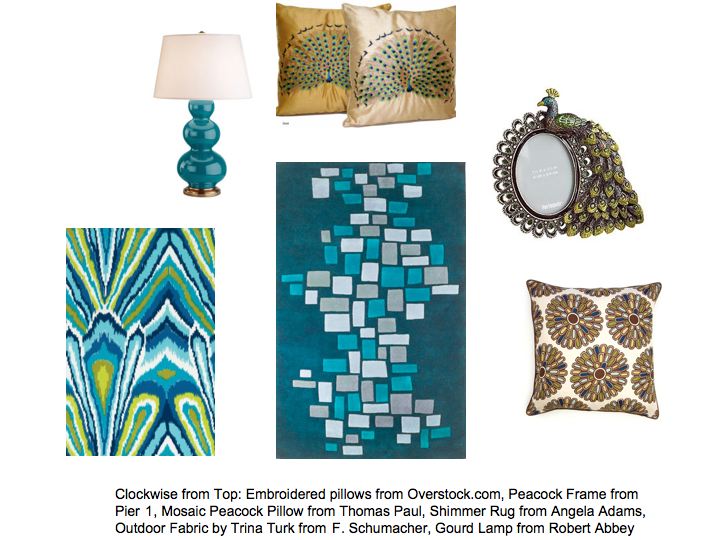
Not only are peacocks showing up as decorative motifs, but the deep turquoise color is quickly gaining ground as a top color trend of Winter/Spring 2010. From punchy, modern patterns on rugs and fabrics to sophisticated classical ceramic lamps, this deep teal tone can work with any style. Think peacock silk curtains with white leather seating and chocolate walls or grey flannel on a classic English sofa with teal gourd lamps.


Sherwin-Williams includes this color in their 2010 Color Forecast.

Pantone’s Color of the Year is the major influence for every industry related to design from Fashion and Interiors to Graphic Design and Paper goods.


Walking in a Winter Wonderland by Kimberly Reuther

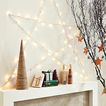
As many people know I am a huge fan of anything white. White has been a very popular trend in design in recent years from the casual, Coastal Living style to the minimalist ice white design. During this time of year, how do you incorporate holiday spirit without adding color? Actually, neutral color schemes require the same balance all year round: texture, texture, texture. Layers of texture and subtle color changes make neutrals work.

For the holidays, adding in a bit of sparkle transforms your space into a wintery escape. Clear glass, mercury finishes, glitter, metallic sheens coupled with earthy burlap textures, wool fabrics, tweed, raffia, and twigs create just the right balance of textures. Here are a few ideas to try out in your home. Let it snow, let it snow, let it snow!

Gray has become the new black as of late. What better way to show off white elements than to put them in front of a gray backdrop. Notice how the textures of the pillows and screen work to reflect light and soften the deep gray sofa. Also, the simple glass vases in a multitude of shapes and colors add a bit of whimsy to the space.

Woodland elements with a modern twist are perfect for adding the layers of texture to a white space. Adding in garland and oversized ornaments can transform any mantel, console or buffet in an instant.

Originally written by Kimberly for Freshome.  View more of Kimberly’s work at kimberlyreuther.com.


What’s So Special About Hickory Chair? by Victoria Dreste

Introduction by Kimberly Reuther

What’s so special about Hickory Chair? They are a furniture manufacturer that has churned out timeless pieces for generations. I’ve long been a fan, especially when the Thomas O’Brien collection debuted a few years ago. I’ve asked a fellow colleague to give recommendations on some of her favorites to stir the hearts of future admirers!

Vicki: “As a designer, I am drawn to various styles and periods. I appreciate the strong, clean lines of a modern look as well as the layers and mixing of a more traditional design. This is why I love furnishings from Hickory Chair. The design elements used cover a wide area of styles; which works seamlessly with my own design aesthetices.”

“The Duchamp is a classic French demilune sideboard. The clean lines and simple tapered legs make it usable in various settings. Aged pewter oval ring pulls and grill overlays add a touch of antique decoration. The Louis XVI side chairs in a silver finish add elegance to the setting.”

“The Fredericka is a beautifully proportioned reproduction of an antique bench. The broad stripe fabric updates the look. The Antoinette side table was reproduced from a find at the Paris Flea Market.”

“This beautiful setting is anchored by the Argonne sofa in deep rich brown leather. Along with the contrast of the white frame it makes a stunning statement. The tuxedo armoire was inspired by a 1940′s cabinet. It is sleek, modern and elegant.”

color trends: fall colors on display by kimberly reuther

How bright and beautiful are all the fall leaves? It seems like overnight the colors exploded on the trees! Equally beautiful are the furniture and accessories on display all over the city. And pretty soon, Christmas season will be upon us! Can you believe the stores are already getting decorations out to sell?

So, I went hunting for fall inspiration this week and here is what I found:

Love, love, love this chair at Niche downtown as well as the red vases. The background color of the store works so well with these deep earth tones!


You don’t have to go much further than your backyard or local farmer’s market for color inspiration. Here is a beautiful tree and my pumpkin display before I paint my designspeak logos on them.


I taught the monthly decorating class at Pottery Barn this weekend and I was enamored with these cute little acorn salad bowls. The glazing is nice and rich and the scale is adorable with everyday white dinner plates! Also, the red leaves pair so nicely with red wine which is indicative of the season as well.


the five senses with Barbara Barry by Kimberly Reuther

A couple of weeks ago, I was fortunate to attend a presentation given by the iconic Barbara Barry. Barbara shared with us images of inspiration and explained how her visions have been realized both in exquisite residences and iconic furnishings.

As she spoke, it was evident that she embodies the theme of gracious living that she envisions for her collections. The soft-spoken, captivating demeanor she exudes is reflected in the effortlessly timeless rooms she creates.

I’ve always admired how unique and enduring her upholstery and lighting pieces are. I found it especially interesting that each member of her collection is transformed into life from a beautiful watercolor sketch.

We were all given the opportunity to meet and chat with her after the presentation. After standing in line for 20 minutes or so, I was nervous to approach such a visionary! What would I say?

Fortunately, she was very understanding and eager to learn more about my career. When I mentioned DesignSpeak, she kindly offered to answer a few questions via email. Much has been written about Barbara’s designs. I was hoping to take a more unique approach with my line of questioning. She happily obliged me and even sent photographs to accompany her answers.

“Barbara, you credited nature’s simplicity and the human form as sources of inspiration. I feel that design inspiration is also closely tied to our five senses. Please describe the first thing that comes to mind for each.”

“Sight…light! It is everything…energy personified.”

“Smell…the warm night air of Los Angeles (which I cannot wait to smell after Russia) full of jasmine and orange blossom.”

“Hearing…the waves crashing on the shore.”

“Touch…my own bed with crisply ironed sheets which I can’t wait to jump into!”

“Taste…a kumquat pulled right off my tree exploding in my mouth with vitamin C…I love California!”

Ah, what an inspirational moment in my career!
Thank you very much Barbara!

pump up the volume by Victoria Dreste

Scalamandre’ has always been known for luxurious silk fabrics. Now they have re-energized classics. These fabrics are edgy and modern. The patterns include lime green chinoiserie, zebra-printed linen and fuschia paisley. A sophisticated, exuberant mix with a great take on color.

Likewise, Knoll has always been known for commercial textiles. Recently, however, they launched a line of fabrics, known as Knoll Luxe. The fabrics are beautiful and luxurious and great for residential interiors. They of course have an added bonus of wearibility, consistent with the Knoll brand.

The latest collection by Proenza Schouler has been very well-received. If you remember, they are the phenomenal design duo who appeared on everyone’s radar when they debuted a collection at Target.


Related Posts Plugin for WordPress, Blogger...