
Design 101: Embracing the Recliner by Kimberly Reuther
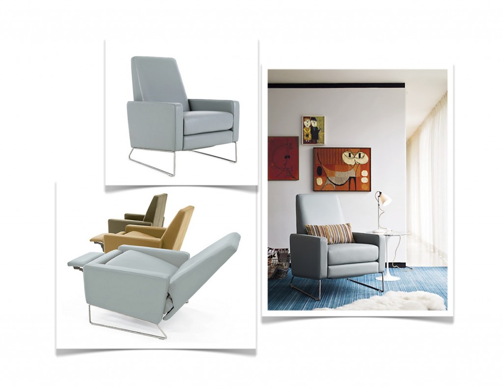
Ladies, we are going to discuss a topic today that you are very familiar with yet want to avoid at all costs. Yes, I am talking about the recliner, a piece of functional furniture that is seemingly a vital organ for the men in our lives. Unfortunately, not everyone has a “man-cave” in their home […]
Color Pop: Using Bold Citrus Accents by Kimberly Reuther
Summer is such a fresh time of year! If you are like me, you may be obsessed with bold citrus hues this time of year. The vibrant colors are on par with the blazing sun and the days spent poolside. Why not infuse a bit more of this color into your home? Here are examples […]
From White Box to WOW by Kimberly Reuther
Most of us love, or at least appreciate, architectural moldings and finishing touches in our homes. However, not everyone’s home is “born” with these elements. I am often asked how to decorate a room that looks like a white box. Bare walls, no moulding, basically a square. While seemingly uninspired to some, for designers this […]
The Right Stripes by Kimberly Reuther
How do you feel about stripes? I personally think a room isn’t complete without a stripe fabric, rug, etc. Stripes are a fundamental part of design. They can change the look of a piece of furniture or a room by being bold or subtle. Stripes can be edgy, playful, modern or sophisticated depending on the […]
Real Simple: Ideas for Simple Glass Vases by Kimberly Reuther
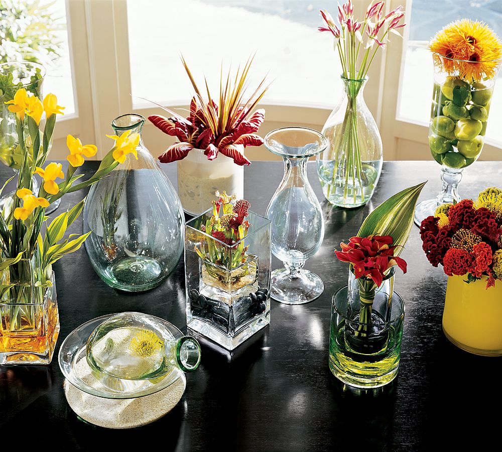
Ahh, it’s spring, the season of fresh flowers and fresh ideas for your home. No doubt, you’ve been cleaning out cabinets and getting rid of things to prep for the summer months. If your cabinets are like mine, you have a multitude of glass vases from flowers being sent to you. But that’s where you […]
Spotted: Industrial Chic Barstools by Kimberly Reuther
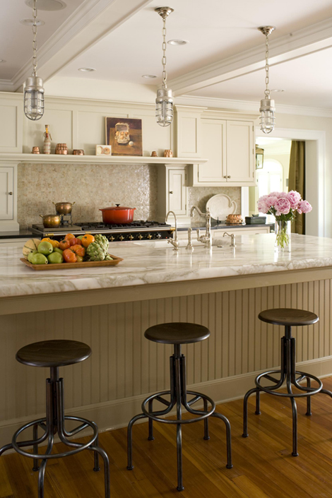
We are seeking different. We want to have a conversation starter when friends admire our homes. We are seeking unexpected touches to add to the mix. Enter industrial chic barstools! They are popping up everywhere! But how do you know which one is right for you? They can be used in both modern and traditional […]
Style Defined: Modern Glamour by Kimberly Reuther
If you are like me, you’ve become accustomed to a certain amount of “bling” in your life. From sparkly cocktail rings to sequined pumps, the dazzling effect gets us through the dreary winter days. As is the cycle with fashion and design, this has spawned the return of a pre-depression era design trend. Glamour and […]
Tips on Achieving Balance by Kimberly Reuther
Who doesn’t need more balance in their lives? We are all seeking the right combination of work and life, income and expenses, needs versus wants. In design, we are striving for a balance of scale, proportion, and textures in the rooms we create. In addition, there is an increasing desire to balance aesthetic appeal with […]
“Come & Knock on Our Door” by Kimberly Reuther
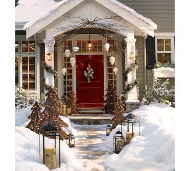
Holiday Tips for Your Front Entrance There’s a quote, “you never get a second chance to make a first impression.” Never is that statement more true than at the holidays as you prepare to welcome dozens of guests and proudly showcase your home in all its festive splendor. By now, you’ve brought out box after […]
Bottom Line: White Kitchen Countertops by Kimberly Reuther
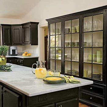
You’ve seen them everywhere lately, it seems. No, I’m not talking about holiday decorations (although that is true, too). I’m talking about white countertops, mainly marble. They are in design magazines, on TV shows, in hotels & restaurants and even your neighbor’s newly renovated kitchen. They are beautiful and alluring yet you are wondering if […]