
Style Defined: Modern Cottage by Kimberly Reuther
Summer is winding down and you’ve bid your goodbyes to the weekend retreats until next year. What makes these sojourns so relaxing and refreshing? Partly, the absence of “real world” responsibility and maybe more noticeably, the crisp backdrop of furniture and finishes that allow you to breathe easier. Here are a few examples of these […]
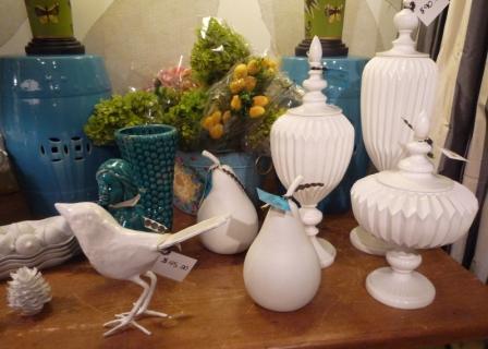
Like a Well-Aged Wine…Vintage Furnishings are Being Uncorked by Kimberly Reuther
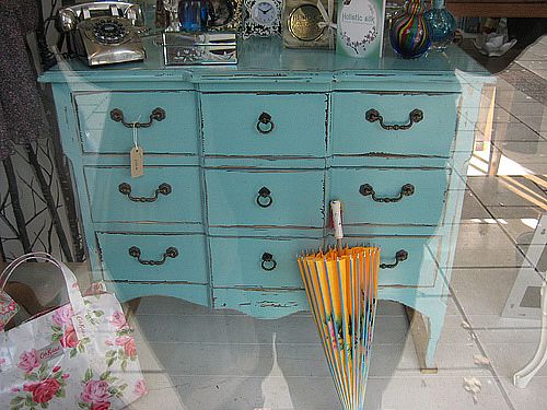
We’re finally catching on…albeit slowly For centuries, our contemporaries around the world have been perfectly content living in vintage buildings and homes. With peeling plaster walls, dramatic moldings and herringbone wood floors, these interiors are reminiscent of previous decades and remain intact for new generations to appreciate and enjoy. Americans, however, have long favored the […]
Which Roman Shade Are You? – Kimberly Reuther
by Kimberly Reuther, Interior Designer & Founder of DesignSpeak (previously posted on AT HOME’s website)
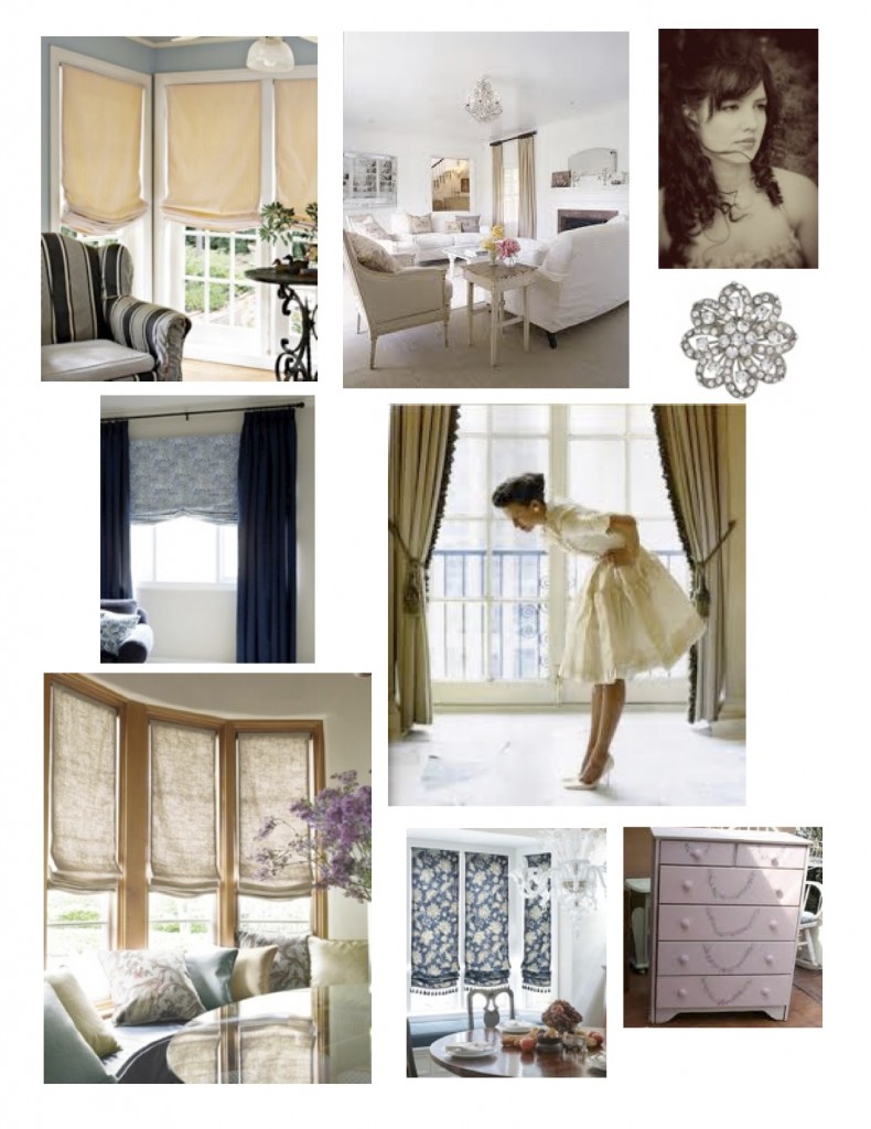
Roman shades are basically the chameleon of window treatments. They can conform to almost any decorating style, window size/shape, they have top down/bottom up features, blackout lining, cordless options for child safety, the list goes on and on. So, how do you determine which one fits your style, home, and personality?
Here, I’ve broken down the basic five types of Roman shades to correspond with specific lifestyle and decorating tastes. As I stated before, they are a chameleon breed so there is no hard and fast rule to follow. Just trust your instincts and imagination to select the best choice for your home!
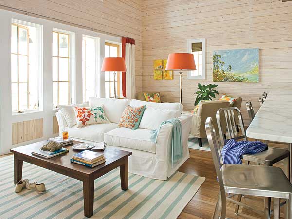
Classic Roman Shades – relaxed americana style, painted, weathered furniture, twill slipcovered upholstery, casual, whimsical accessories, kid-friendly spaces, crisp color palettes, cottage stripes, farmer’s market, coastal indulgences
Style Defined: Modern vs. Contemporary by Kimberly Reuther
You see a cocktail table and fall in love. You wonder if it would work in your home. You try to describe your home to the salesperson. He/she asks “Is your style modern or contemporary?” Your mind scrambles. Am I modern or contemporary? How do I know? How do I define my style? This scenario […]
DIY – Chevron Pattern Dresser – Kimberly Reuther
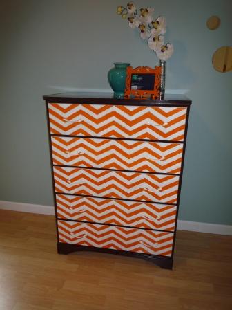
Those who know me best are well aware of my ability to envision possibilities in almost any space and are always pleased with the finished product. However, knowing my visionary ability means they are also cognizant of my low tolerance for detail work and executing these visions myself. Therefore, when I conceptualized transforming this drab […]
New Inspirations by Kimberly Reuther
So, the groundhog saw his shadow and we have 6 more weeks of winter, blah! Time to start planning for spring while we wait…I’m a huge planner! Getting things done is another story, but at least I have a plan 🙂 In searching for unique things to admire, I came across a few global items […]
Think Big: Using Accent Colors in Your Home – Kimberly Reuther
So, you love to wear that blue sweater and it really makes your eyes sparkle. You always get lots of compliments and basically deep blue is your favorite color. How do you incorporate that into your decorating scheme? Bold accent colors are not for the faint of heart! For those of you that love color, […]
Bottom Line: Kitchen Backsplashes by Kimberly Reuther
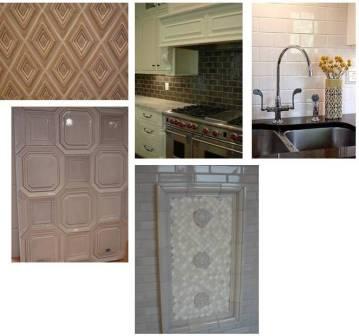
Welcome to a new series of blogs designed to help you prepare your budget for your remodeling or new construction project. The first topic we are going to tackle is tile for kitchen backsplashes. There are numerous sizes and materials to choose from. How do you know what is right for your budget and your […]
Cocktail Hour Chic: Timeless Classic Furniture by Kimberly Reuther

It’s 4:59, the clock hands are slowly ticking away the moments of time until you can escape your 9 to 5 routine and slip into something more comfortable… Inspiration Photo from House Beautiful Cut to 5:25…You are home on your plush down sofa, cocktail in hand, listening to your best friend dish about the latest […]
Think Outside the “Tree”: Non-Traditional Holiday Decorating Tips by Kimberly Reuther
At a young age, we are taught to “think outside the box” and discover our own uniqueness. However, when it comes to interior decorating, many people have a hard time finding their vision. I’m here to offer some ideas for non-traditional ways of decorating for the holidays. Color is a good place to start. Many […]