January 14, 2012
by kimberly reuther
1 comment
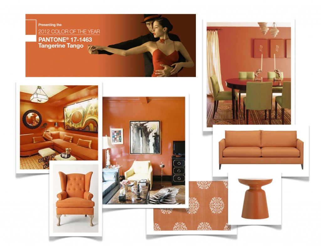
Hello Orange! Tangerine Tango has been chosen the color of the year by Pantone. What a fresh start to 2012! Orange can be a very tricky color, people usually love it or hate it. Well, let’s take a closer look at its merits and I bet you’ll start to warm up!
Orange has the energy and vibrancy of red but without the dramatic undertones. Orange has the spirit and sunny qualities of yellow but it is equally grounded in earthiness. It plays well with other colors but sometimes can’t help but stealing the show. So, now how do you live with orange?
– Go big or go home!
If you are a lover of orange and bold choices, then by all means, saturate a room in this splendid hue! Tip: When painting with a dark color, using semi-gloss paint will reflect light and keep from closing in the space.

– A little color goes a long way.
If you want to add a pop of color to your room, here are a few ideas to try. Tip: Make sure to incorporate the color in at least three places to carry the effect.

– The more the merrier!
If you want to balance the boldness of the orange, why not add a few more colors to the mix? Tip: Use patterns or solids but make sure you give each color enough weight to create cohesion in the space.

– Explore new directions.
Draw from fashion, change the hue a little, use the color to spark your own personality. Tip: Paint and small accents are the easiest pieces to update if you like to follow trends.

Have fun incorporating this fresh color into your home!
colorspeak
January 28, 2010
by kimberly reuther
1 comment
So, you love to wear that blue sweater and it really makes your eyes sparkle. You always get lots of compliments and basically deep blue is your favorite color. How do you incorporate that into your decorating scheme? Bold accent colors are not for the faint of heart! For those of you that love color, here are some great ways to use them in your home!
As with anything, it is all about balance. When you use a bold color on an accent wall, make sure it is the focal point of the room and that the rest of the pieces complement the intensity. For instance, this blue wall is deep and rich. The collection of white furniture gives it the bold contrast and, in conjunction with the chocolate accents, the weight needed to counteract the depth of color. The result is perfect balance.

Bold Color Inspiration
The same is true for the red accent in the photo below. The black and white color palette, along with the beautiful pattern of the rug, visually moves your eye around the room and ìlandsî on the deep red headboard.

Statement Headboard
Below, is an example of 2 accent colors. The deep khaki, almost chocolate, color is basically a neutral since it encompasses the entire space. The soft French blue door, along with the punch of pink on the settee jolt life into the space and instantly make it a more interesting place to arrive.

Bold Color Accents
Here, they have used a more subtle accent color because the entire palette is subdued. The color is used in smaller things but it is repeated enough to be effective.

Neutral with Blue Accents
This kitchen is anything but subdued! How fun and bright is this blue island and matching floor? In the case of this ìaccentî color, it is used so much that it is almost considered a ìneutralî. Notice, how they still balanced it with lots of white, natural light and high ceilings. Beautifully done, it is definitely eye-catching!

Be Daring!
Previously written by Kimberly for St. Louis AT HOME’s website. Read more of Kimberly’s work and view her portfolio at www.kimberlyreuther.com
colorspeak, St. Louis AT HOME